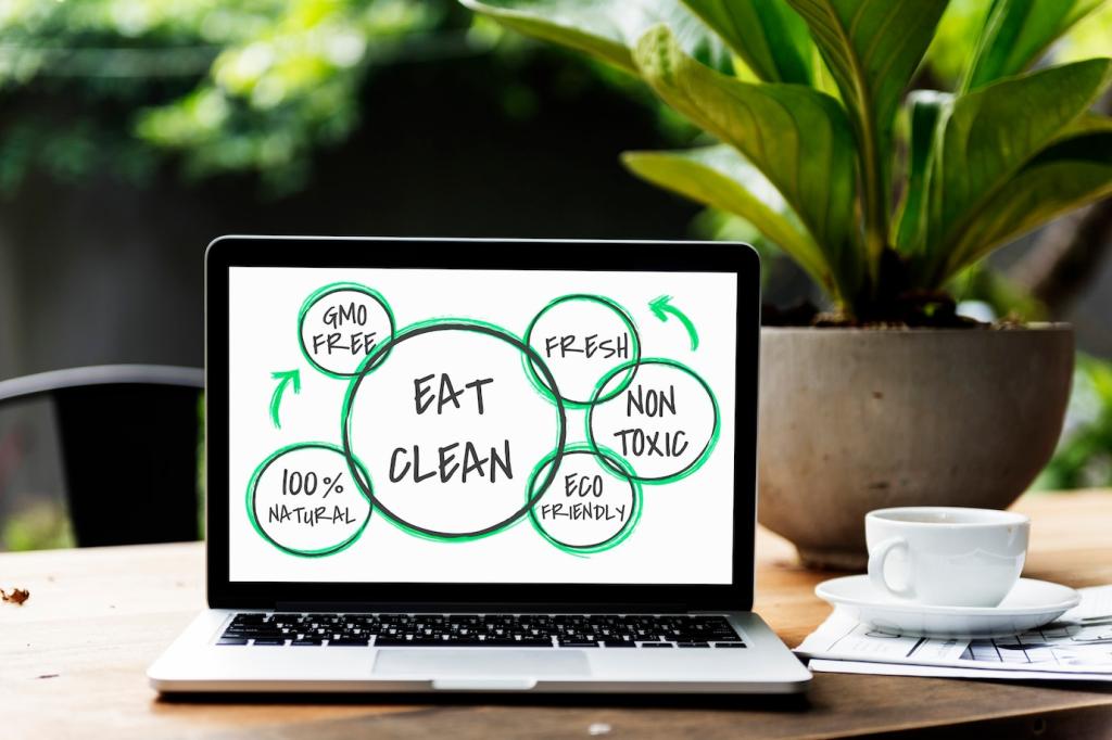
Maximizing Impact with Green Features Highlighting
Define a Clear, Credible Green Value Proposition
Translate Features into Human Outcomes
A heat pump is not just “efficient”; it means lower bills, quieter nights, cleaner local air, and warmer mornings for families. One startup reframed “5,000 kWh saved annually” as “the energy equal to 1,250 cups of coffee you did not burn.” That single metaphor boosted recall and newsletter signups. Try turning your kilowatts, liters, or kilograms into daily-life equivalences your audience already understands.
Avoid Vague Claims; Use Specifics
Replace “eco-friendly materials” with “78% recycled aluminum, verified by third-party audit in 2024.” Anchor claims to a baseline, a timeframe, and a standard. Readers trust numbers tied to real-world comparisons, not adjectives alone. Post your best metric in the comments, and we will feature a community breakdown of how to strengthen it with clarity and context everyone can follow.
Anchor Benefits to Stakeholder Priorities
Executives hear cost savings, facility teams hear reliability, and residents feel comfort. Craft parallel headlines for each audience segment highlighting what matters most to them. The green feature remains the same, but the framing shifts. Ask your sales or support teams which questions recur, and let those questions guide your benefit statements and the order they appear on your homepage.

Before-and-After Emissions Dashboards
One real-estate developer overlaid a simple CO₂ timeline atop a construction photo, showing the curve shrinking after switching to low-carbon concrete. The visual beat paragraphs of explanation. Add “tap for sources” so skeptics can inspect the data. The result was fewer objections, more demo requests, and a repeatable way to explain progress at town halls and board meetings.

Interactive Impact Calculators
Let visitors input their building size, commute pattern, or device usage to instantly see emissions avoided, money saved, and time to payback. Real-time feedback creates ownership and curiosity. In user tests, calculators increased scroll depth and trial activations, especially when paired with a clear “what happens next” CTA. Share your calculator idea, and we will workshop it in a future article.

Materiality Maps Made Understandable
Turn abstract ESG priorities into a clean matrix highlighting what matters most to your audience. A beverage brand spotlighted water intensity and circular packaging, not everything under the sun. By focusing, they earned trust and attention. Pair each priority with one visual proof point, a single metric, and a link to deeper documentation for readers who want every detail.
Earn Trust with Proof, Standards, and Transparency
Logos alone are not enough. Explain what each certification covers, who audited it, and any limitations. A simple “What this means” section beside the badge improved comprehension in testing. If a scope is narrow, say so. Counterintuitively, plain honesty often raises perceived credibility and reduces the sense that sustainability is just marketing spin.
Publish a concise methodology page: boundaries, data sources, emission factors, and update cadence. Invite expert feedback via a public email or form. One company shared its calculation sheet and received corrections that improved accuracy and goodwill. Openness signals you care about getting it right, not just looking good for a quarterly press release.
Quote independent analysts, reference recognized frameworks, and benchmark against peers. A clean graph showing performance versus sector average can be more persuasive than brand copy. Cite Science Based Targets, CDP, or ENERGY STAR if appropriate. Your aim is to make the audience think, “Others check this math,” which lowers perceived risk and speeds decisions.


From Boiler Room to Break Room
A school custodian described how new insulation stopped winter drafts in the cafeteria, making lunch quieter and kinder. Pair that voice with your energy savings chart. Readers relate to comfort and dignity before kilowatt-hours. The story reframed maintenance upgrades as a daily wellbeing win for students and staff, not just a line on an engineering report.

Customers as Co-authors
Invite users to submit photos, short videos, or meter snapshots showing green features in action. Offer editing help so their voices shine. One utility turned customer submissions into a monthly impact reel that outperformed paid ads because it felt like neighbors talking to neighbors. Encourage replies with a simple prompt: What changed in your day because of this feature?

Moments of Truth on the Frontline
Capture the first delivery made with an electric truck or the maintenance team’s reaction to quieter equipment. These moments humanize transformation. Combine a candid image with a caption linking the scene to one key metric. People share feelings; feelings carry the facts farther than charts alone can manage on a crowded feed.
Design for Conversion Around Green Moments

Persistent Eco Badges that Earn Their Place
Use a subtle badge that updates dynamically—“424 kg CO₂e avoided to date”—and link to the methodology. Only display it after the system reaches a meaningful threshold so it feels deserved, not decorative. This small, living proof point keeps sustainability visible without shouting, and it consistently lifted trial starts in usability studies.

Microcopy that Nudges without Preaching
Swap moralizing language for practical clarity: “Choosing the refill saves 14 grams of plastic and ships carbon-light.” Test tone, placement, and length. Users respond best when you explain the why and how in one breath. Keep it human, not corporate, and invite feedback directly on the page so visitors feel part of the improvement loop.

Offer Meaningful Next Steps
After highlighting a green feature, provide a next step: schedule an audit, enroll in a pilot, or switch to a renewable tariff. Keep forms short and show the expected impact of their action. When the path is specific and helpful, curiosity becomes commitment. Tell us which step converts best for you so we can share patterns.
Measure, Learn, and Iterate

Likes are nice, but adoption rate, avoided emissions per user, and conversion to durable behaviors matter more. Set targets, instrument events, and review weekly. Tie content updates to KPI shifts. Publish a scoreboard internally so teams align around outcomes, then bring a summarized version to your audience to show progress and stay accountable.
